As I wrote in my last post about coloring my lettering drawings, I LOVE when two-dimensional art feels like a sculpture. I also wrote about how adding color can feel like it takes away from this three-dimensional, tactile feeling for me. However, adding color to this piece felt right! I wanted to use some "jucier" colors, like jewel tones—something that felt like a deep blackberry, or ink. Here's my process!
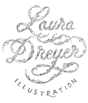
1. I started with this pencil drawing:
2. Adding Color
And then I added magentas to the linework on periwinkle background in photoshop. I didn't want to use the full range of values, because I wanted it to feel a little dustier and gentler than a deep, dark blue. Adding some pink (You know I had to!) brought out some subtle warmth to flesh tones, and I called it finished!
Here's a closeup detail shot:
You can see more of my dream portraits here!
Thanks for reading! - Laura


